Tuesday, December 29, 2009

The importance of the right white balance

I talked about images from this place before. This is from a little stream in Zion National Park. It is an extreme example of how important it is to know the right white balance. Below I show a single shot from this place using the as-shot white balance, auto Lightroom white balance, daylight, cloudy and shade, and lastly the white balance taken from the neutral patch on a x-rite colorchecker passport. These images, apart from the camera landscape profile are using completely default processing values.


I made this hextich using the print panel in Lightroom and added the text in Photoshop. Click for bigger. As you can see, both the camera and the auto white balance get this completely wrong. The as-shot and auto are far from reality. The rocks on the top left should be orange as they are standard Zion sandstone. The water should not be Cobalt blue. I should also point out here that this image was made at the bottom of a steep canyon where one cayon wall was lit by the sun, causing a very strong glow light in the area where we were. The water is reflecting the light from this canyonwall. Assuming different white balances gets very different results. You can see the results from assuming daylight to shade. Each is giving very different, but much more pleasant results than "as shot" or "auto". The last panel shows what happens when using the neutral patch on my white balance card on the x-rite passport. It is even warmer than "shade"! Of these, I think I prefer shade as the colors are more interesting. One example in which using a white balance card actually is not that helpful. I came accross many more situations like this in the Narrows and other places where the light was just very strange and where my eyes were not seeing what the white balance standard thinks I should be seeing.

EDIT: I posted another illustrative example in a recent blog post.

See more images from Zion in the link.

Saturday, December 26, 2009

A word of caution on using custom camera profiles

If you own a colorchecker, you can use DNG profile editor, or X-rite's passport Lightroom plugin to create a custom camera profile for your camera. This works really well. I should however caution you about an issue I discovered with this. One of the problems is that neutrals are not kept neutral when you change to a different camera profile in Lightroom or ACR. An illustration is given below.


On the left is the result of first assigning my self-calibrated profile generated using the passport plugin (this is also true for other profiles) and then using the white balance dropper on the neutral patch on the card and on the right is the result of first setting the white balance and then assigning the exact same profile. As you can see on the right, my very neutral grey backdrop turns green and the girl's skin is rendered a little too yellow. The skin tone might not be too bad but the green backdrop is very distracting I think. On the left, the color is just fine, no tint to the backdrop and good skin tone. The difference is simply in the white balance chosen by the white balance dropper. The image on the right, Lightroom chose 5700K and -3 tint, while on the left, it chose 5450K and +12. Quite a difference for white balancing on the same patch! I tested with all the other camera profiles and they all show this problem that there is a shift in the color temperature taken from the neutral patches.

P.S. if you prefer slightly more warm skintones than the very neutral rendering you get when using the neutral patch, the passport has a set of warming patches in the top row. You can simply select patches more to the right of the standard patch to warm up skintones. This results in the backdrop staying far more neutral but just the skintones warming up. A far more pleasant effect. See below for the result of choosing the patch two spots to the right of the neutral patch (the middle one in the top row of neutral patches. The second row of neutral patches also allows you to go to cooler colors and is more useful for landscape photography.


This made Lightroom choose 6000K and +27 tint. The skintone that resulted is very nice I think.

Conclusion: do your custom white balance after assigning the profile you want to use.

EDIT: It appears that this is mostly a problem with self-created dual illuminant profiles. I create these by shooting one image under tungsten light and another in sunlight as I don't own a calibrated D65 reference. Whether I create the profile in X-rite's passport program or DNG PE, they show the issue of neutrals not staying neutral. The Adobe-supplied camera-matching profiles also have the problem, but it is too minor to worry about. The differences in grey-card set white balance are on the order of 100K which you won't really notice.

Tuesday, December 1, 2009

How our eyes deceive us

I was aware that our perception of shade and color is very much determined by context. There is the famous cube on checkerboard trick where we perceive two tiles of absolutely the same shade as different shades of grey or the one where context completely changes perceived color. Now John Nack posts a link to an amazing optical illusion on his blog. You have to see it to believe it.

Sunday, November 29, 2009

More images from Zion

As a followup on yesterday's post, I'm Just posting a few more images that I liked.


This is at a place called Big Bend.

A waterfall close to the start of the Narrows. This is a long wispy thing that comes from far up high. I liked the reflection on the wet rock.


This is in the river in the main area of the park. I liked the deep red and yellow colors and the friendly little rapids with lots of leaves stuck in it.


This is a sunrise at the Towers of the Virgin, a classical image of Zion.


Check out all images in this gallery. There is also a smaller photoset at flickr for those that like the social networking thing.

Saturday, November 28, 2009

Zion National Park

I fonally got around to assembling and culling some images from Zion National Park. I was there with my friend Dave for a weekend, followed by a hike to Calf Creek Falls in the Escalante area (more on that place later). We hiked the Narrows, shot some sunsets and sunrises and visited the Kolob Canyons area. Here is a sunset along the Virgin River:


This waterfall is at the start to the Narrows


This is a corner inside the Narrows. Some hikers are visible in the distance. I decided to not clone them out. Inside the Narrows, we met a few photographers. The interesting part was that many of them turned around at the first deep area because it was "impossible". It was actually lower than when I last was there and hardly a problem with the wet suits we were wearing. These things are quite amazing. I did not feel cold at any time, even though it turned out that when I after the hike entered the river wearing just Keenes on my feet, the water was very cold.


The light inside this place is quite strange. It gets a very strong orange color that makes the camera pick weird white balances. When I correct this using a grey card, however, the image appears far too warm, so I left it to my own creative devices and corrected to what I experienced. A white balance card does not work in these circumstances!

This is a sunset along the Virgin river looking at the Watchman and Bridge Mountain. There was some good fall color here.


This was just a tad upstream from the famous bridge, where every evening we came by throngs and throngs of photographers were standing all taking the same image. We resisted the temptation to join them. It is a very nice image though as evident from this image taken by Stephen Trainor who turned out to have been there the exact same weekend.

We also hiked up Taylor Creek in the Kolob Canyons area of Zion. Here we found that on that side of the park every single leaf had already been blown off. This was a strange contrast with the main area of the park, where fall color was mostly just starting! This is a nice reflection from a glowing canyon wall in a small waterfall we found.


This was another one of those areas where a white card white balance gave just too extreme results (you can see some of that in an image I posted earlier) so I dialed it down a little which brought back some other tones than yellow.

On our way out, we went east up through the tunnels and took some images on the checkerboard mesa area.


We had a fun weekend and saw some beautiful stuff there. Check out all images in this gallery. There is also a smaller photoset at flickr for those that like the social networking thing.

EDIT 1: Some more images are posted in the next post.

Tuesday, November 24, 2009

Wishing lanterns

In Seoul, Korea:

Wishing lanterns in Seoul

Done using my RIM cellphone (wish I had an iPhone instead of a crappy, company-mandated BlackBerry ;) ).

Thursday, November 5, 2009

Virgin river reflection

This is a scene I found last weekend in the Virgin river in Zion National Park. The yellow color is a reflection of fall color on trees around the river. I have another image that at some point I'll post that shows the entire scene. I just liked the abstract shapes in this detail.

Rolling

Tuesday, November 3, 2009

Golden waterfall

I went with my friend Dave shooting around Zion. We shot an enormous amount of images that I have to somehow find the time to put together. I'd like to show you at least one image that I put together in my hotelroom at night. This is a small waterfall that Dave had found a few years ago along the Taylor Creek trail. The water is reflecting the rising sun on an opposing mountain and is getting blurred by the long shutter. The color was indeed outerworldy.

Golden waterfall 1

As always this is an image assembled from multiple images, so it is very high resolution. The detail in the original is amazing. There will be much more to follow as I can see a gluttony of amazing images ripening in my Lightroom Library.

EDIT: see this image large on my sales website here.
More from Zion is in this and this blogpost.

Tuesday, October 27, 2009

Assembling a high res image

I was playing with Lightroom 3 beta and discovered that you can now set the background color in a print layout. Excellent! Also, I just happened to generate the following little grid of images that make up a larger panorama. I thought this looked quite nice actually.


I develop these images very flat on purpose to enable better panoramic stitching.

Assembled using hugin and after doing some post treatment just in Lightroom this becomes the following.

This image is 7500x9930 pixels. I have this in a gallery over here, where you can order prints from it. Because of its very high resolution, you can print this image extremely large without loss of quality.
As I promised earlier, when I have time I'll write a little tutorial on how you can do this.

EDIT: playing with the images in LR 3.0 beta, I created the following. This is the top middle image in the collage above but edited individually. This is using the Adobe Standard profile and very modest edits (mostly the blacks and a small amount of added vibrance. I sometimes find such images in my sets that were unintentionally composed quite well.

Warm colors

Thursday, October 22, 2009

More detail

Warning: extreme pixelpeeping alert! You are not going to see any difference if you don't print extremely large.

Now I've give you the disclaimer, I want to say that I am really quite impressed with the new demosaic in Lightroom. I posted one example before where you could see the subtle effect that made the LR 3 images look more natural and allow for larger prints. Here is another example where instead of using the same sharpening settings, I tried to optimize both the LR 2 and the LR 3 version. It is not possible to get the LR 2 version to show anywhere near as much detail as the LR 3 version. The LR 3 version also looks far more natural and less fake. Surprisingly, you can even see the effect a little bit in the scaled down version that I use below as a placeholder. Full-res version in the link where you can really see the difference.


Of course, the left is LR 2 and the right LR 3

Edit: David Naylor comes to very similar conclusions on his blog.

Edit 2: This is the lower right corner of a frame shot using the ultracheap Nikon 18-55 mm kit lens. Parameters: Nikon D300, 18-55mm f3.5-5.6, ISO 200, f8, 1/60 s, handheld. It always amazes me how sharp this cheapo lens can be.

Lightroom 3 new demosaic

It appears the new LR 3 beta includes a new demosaic algorithm and sharpening algorithm. The amount of detail you can extract from the images has gone up by leaps and bounds. You can also go much farther in sharpening than before without the image starting to look like a waterpainting. One nice thing too is that you can also inside LR 3 beta, select the old rendering engine to directly compare. The option is in Develop in the Settings menu, submenu "Process Version". Below is a quick example of the huge difference in detail. This is a scree slope somewhere in Rocky Mountain National Park, so lots and lots of fine detail. The image below shows the LR 2 version. Mouseover for LR 3. You might have to wait a few seconds for the second version to load. Also note that since these are medium-high quality jpegs, some detail is lost in the jpeg conversion.


When I have some time, I'll provide some more analysis. For now, it is looking very very good.

UPDATE: The above image but scaled to 200% Here you see that the new algorithm will really help very large prints (the full image below would correspond to a print of 4x6 feet!. The mouseover version (LR 3) is obviously far better as it doesn't show the weird watercolor effect that you can often get in LR 2.


Here's another example.

Wednesday, October 21, 2009

Lightroom 3 beta

All over the web and finally repeated here (sorry had other stuff to do then post to my blog ;-) ). Check it out.

Mamiya releases new medium format digital camera

And it is relatively affordable: See here. A 22 MP one for about 10k$ and a 28 MP one for 15k$. These are very nice prices compared to the competition in this format. The cameras are compatible with all Mamiya AF lenses of which there are many floating around on ebay, craigslist and of course keh.com. It appears that, like the Leica M9, these cameras output a file format that makes them work directly with Lightroom and other such programs without any updates needed. That is great news and more camera manufacturers should listen to their costumers that generally do not want to be locked into the camera manufacturer's generally crappy software (are you listening Nikon and Canon?). DNG is a great choice for such a file format.

Sunday, October 18, 2009

Colorchecker passport minireview

I got myself one of the new colorchecker passports. This product has three different targets in a little make-up mirror format. There is a classic colorchecker that we all now and love, a large white balance target and a "creative enhancement target". The package also comes with a CD with software that allows you to create calibrated dng profiles for use in Lightroom and ACR. There is even a plugin that works straight from Lightroom that is very handy.


Figure: The colorchecker and the creative target in direct sunlight. I white balanced this image from the neutral patch on the creative target and created a DNG profile that is used to correct the image. The image looks almost identical to the real life colorchecker. On mouse over you will see the rendering using the Adobe Standard profile for this camera (A Nikon D300).

Above, by mousing over the image, one can see the results from me calibrating my main camera. There are clear differences in the rendering of a few of the patches and the overall image appears warmer in the calibrated image than in the standard profile version even though both raw renderings were white balanced on the same patch. This might have to do with the very harsh sunlight at the altitudes here. I get far better skin tone rendering using these new profiles generated from the colorchecker. You could do this before (and I have done it) using a standard colorchecker and DNG profile editor. Strangely enough there are small differences between the profiles generated by the two different methods. Something to check out. What's most important of a card like this is to be able to get an accurate white balance. An example is below. This is a shot in my son's room with light from several compact fluorescent bulbs. The walls are painted lightly blue and my camera just has an extremely hard time measuring white balance correctly. The below shows the shot with default settings in camera and in Lightroom and the mouseover shows the result of balancing using the grey card and using a calibrated profile (less important here).


Figure: my son using automatic white balance and grey card white balance (mouseover). Mouseover this link to see the same but with the Adobe standard profile.

His pajamas of course are deep blue, not muddy cyan. Needless to say that the image that used a greycard for white balance is far better. There is not that much difference between the standard profile and the calibrated profile and there it comes down to taste.

The creative target that is provided (see the right part of the top image) is very handy as it changes both temperature and tint instead of just temperature. I measured the white balance change and in the top row (little portrait icons) of white balance patches, each successive patch shifts the assumed white balance up by about 250K, while the tint shifts by approximately 6. In the landscape row, each successive patch shifts by about 300K, while the tint shifts by about 7.5. You can do the same thing with the white balance quick adjust in Lightroom, but that shifts with larger steps and does not bring the tint along. The creative target on the passport is clearly well thought out in my opinion.

In conclusion, it is clear that using a correct color balance is very important especially in difficult light. You can use the colorchecker to very easily generate calibrated profiles for your camera which can significantly alter your image's appearance in limited circumstances.

Raccoon phase II

Yesterday, I discovered that the raccoon from the previous post (it is the same one as you can see from his coat "design") had made his home under a nook under one of the subroofs. I got some nice shots from him, but still had to chase him off and make the spot where he was hiding a little unpleasant for him as I don't want him scurrying around where my small kids are playing. These are very cute looking animals but they can often scratch and bite people. This is not good as they sometimes carry rabies and distemper. The garden hose helped and I haven't seen him since he ran off. This is far from the only raccoon in our neighborhood. Neighbors of us were in their livingroom and suddenly noticed eyes staring at them - from the fireplace.

Squatter

2009-10-17 Cute Squatter

Tuesday, October 13, 2009

Nikon announces new high ISO monster

The D3s. The thing is capable of ISO 102400. The Sample images show amazingly clean ISO 12800. The ISO 102400 I am sure of course is a trick mode (HI 3) that is really ISO 12800 boosted in software. Still the images very impressive as I am sure the price will be. For the rest it is like the old D3. And oh yeah, there is a movie feature which shoots in silly time-limited mjpeg, a codec from the stone age that nobody uses anymore. Why no mpeg4/H264? Now the question is with the D3s and the D3x, where is Nikon's answer to the Canon 5D mk II? The D700x?

Tuesday, October 6, 2009

Nobel Price for physics

Just heard this on the radio this morning. The inventors of the CCD chip, Willard S. Boyle and George E. Smith, won the Nobel price for physics. The CCD chip set of a revolution in digital imaging and scientific sensors. It's hard to overstate its importance for photography. Well deserved if you ask me. They are sharing the price with Charles K. Kao, who won for his work on fiber optics. Also extremely important in today's world for communication and many other applications. In my day to day work, I use both CCDs and fiber optics all the time for scientific research. Interesting to see them both being recognized at the same time.

Monday, September 28, 2009

Waterfall

I spent a small amount of time up in the mountains this weekend and found a little stream to photograph. There is still a lot of green high up, so the peak hasn't been fully reached yet. There will be lots of opportunities still I am sure.


(black and white conversion here)

I also made a horizontal version of the latter, which I think looks really nice:


As always, these are very high resolution composites of multiple images. My logo will not show up in prints of these images.

Tuesday, September 22, 2009

Chasm Lake at dawn

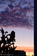
Prelinks before the post:
Last Saturday, I finally was able to get myself out of bed at an ungodly hour of 2 am in order to photograph the sunrise at Chasm Lake. I had been planning to do this for a long time and my research showed that the light was still good, but wouldn't be for very long anymore. Chasm Lake is at the foot of Longs Peak (yes no apostrophe) in Rocky Mountain National Park. I remembered vaguely that it was a good distance hike as I had done it several times before and I had looked around for hiking times. One guide book and a web page mentioned about 3h20m for the 4.2 mile hike, which seemed long to me, but perhaps the altitude makes it more difficult. So I got up at 2 am, turned on the coffee machine and got dressed and hopped into he car hoping that the coffee would keep me awake. It was more the blaring car stereo that did it though. I got at the trailhead parking (which was almost full already as is normal on the weekend) at around 3:30 am, and started hiking at 3:45. Since the sun was going to rise around 6:46, which I knew owing to the GPS and to checking the location in the excellent TPE app programmed by fellow Colorado photographer Stephen Trainor, I thought I'd better hurry if I want to catch the predawn glow. Along the trail which is initially mostly in the forest, I passed many very friendly folks (it's a strangely social event going up this trail around 4 am because of all the people attempting to summit Longs). Up above the treeline, the starry sky was spectacular (moonless night) and I could clearly see the Denver metropolitan area. I scrambled the last few boulders and saw the lake and Longs' diamond face before me. However, it was still very dark. I checked my watch and it was only 5:30 am, still over an hour to go and apparently if you're motivated, 3h20m turns into only 1h45m, giving me plenty of time to check out some locations. I chatted a little with some very cold climbers that had bivouacked there and found some locations right next to the water and waited for the sun to come up.

Waiting for the sun to come, I tried to make some star trail images realized that I did not bring a remote release. This oversight stops one's ability to make bulb exposures so I had to work around this by combining multiple 30 second exposures, with the result that the star trails look like morse code. Next time better I guess. The star trails are more easily visible in the image when you click on it.


Shortly before day break, the sky and mountains started glowing beautifully purple. The image below was taken 20 minutes before sunrise using a 13 second exposure.


Ten minutes later I generated the following high-resolution composite on which you can see the lake more fully as well as the lake shore.


At about 6:46 am this is what it looked like. The mountain was suddenly on fire and the glow contained oranges, reds, and magentas and even bright yellow in the vertical ledge in the middle:


A more close-up view is here:


After about 5 minutes, suddenly the sun disappeared behind a hazy layer for a few minutes and the light turned sullen grey. I was afraid that the good light would be gone already after only a few (but intense) minutes. Here is a link to an image during this grey period. However, this was by far not the end of it, and 5 minutes later, the sun came back with a vengeance. Now the mountain and the lake where bright yellow:


There are some more colorful images on the smugmug gallery.

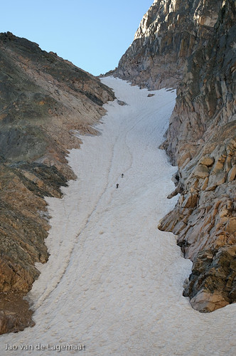
Looking over my shoulder I could see another photographer shooting further away from the lake but pointing in the same direction (I wonder why?). I wanted to go meet him/her but he/she was already gone when I was ready to move on. So I decided to continue my journey along the north side of the lake towards the bottom of the diamond. This was a hard scramble over a large boulder field, some traversing along a big slab and following a snow field with a deep chasm on the side up. Finally on the tip of a moraine, I took some images looking straight up at Longs using extreme wide angles. Here is a good example:


Amazing that people climb this. I have quite a few friends who have done it, but I can't imagine what it is like not being a technical climber. I could see some climbers going up and if you look at the full res (60 MP+) version of my images you can see people. More clearly could I see climbers going up Lamb's slide to the left:

Going up Lamb's slide

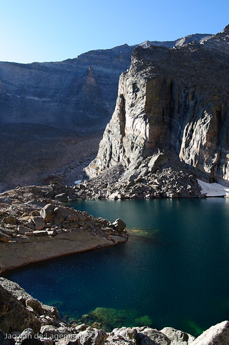
I had my breakfast up here and headed back. Talked to some climbers I met that were just coming up and snapped some images such as this of the lake and Ship's prow:

Ship's prow

Crossing the stream I came upon this view, which unfortunately I had not found before. I think this is the view to get at sunrise:


I converted it to black and white here as I thought it quite dramatic. If you mouse over you can see the color version. The blue of the sky was extremely deep even without polarizers.

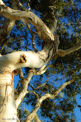
On the way down in the forest I noticed some turning Aspen:
Turning Aspen

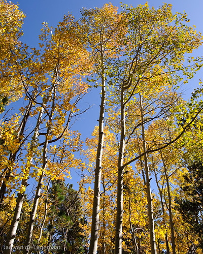
I think they provide a nice conclusion to the post.

The role mystery in landscape photography

There is a wonderful article on photography blog by David Ward where he talks about "mystery" in landscape photography. He illustrates with some superb examples and identifies four different forms of mystery, namely scale, spatial ambiguity, lighting, and incongruity. Well worth a read. David makes fantastic imagery and his website is also well worth a check.

Friday, September 18, 2009

Minor site redesign

I've been playing with the CSS template for this blog in order to generate a clearer layout for the site. I wasn't happy with the optical separation between blog posts and the general fit and finish. As you can see, I now have a (more than) full-width top image and I changed some minor elements. This all looks fantastic on the browsers I have access to, namely Safari, Firefox, and Chrome but I do not know what it will look like in IE. I know that the drop shadows I added to the site title and other headers (which are CSS3 properties I understand) probably will not work in Internet Explorer, but they look very nice on the browsers that everybody should be using. Let me know what you think and also if you find any bugs in the layout. The screenshot below shows what it should look like. The framed image on the right will indeed cut off if you decrease the width of the browser window too much. Don't know yet how to solve that but this only arises when people have very low resolutions set on their displays.


EDIT: should have gone for a Droste Cocoa can effect.

Monday, September 14, 2009

Lightroom 2.5 is here

Time to pludge! Check it out here. Delivers support for some new cameras, better support for cameras with a unconventional Bayer mosaic where the two green sites have a different spectral response. It also fixes an issue that many windows users had where you could not make Lightroom NOT popup when you insert a memory card. That one frustrated a lot of people apparently.

Thursday, September 10, 2009

Reviews of the new M9

Just a quick ist of reviews I saw looking into the new M9.
Luminous Landscape. He loves it.
Jonathan Slack's review (lots of great pictures)
Dpreview. They also actually touched one.
Focus Numérique. If you read french. They have some 100% blowups of high ISO images.
Ken Rockwell. He doesn't have one yet, but still waxes lyrical.

If you know of any more let me know. Concerning reviews, I just don't understand why Leica doesn't think I am worthy enough to test one ;-) . Of course, I am far from wealthy enough to be able to afford one, so I am decidedly out of the market. Still it is is nice to finally see a nicely simplistic, well designed, rangefinder camera with a full frame sensor.

EDIT: Another nice one here from David Farkas.

Monday, September 7, 2009

Leica M9

The web is abuzz with the (obviously not by accident) leaked specs for a new Leica camera called the M9. Apparently this will be a full frame rangefinder with 18 megapixels. I scoured the (adorned with very enjoyable Cuban street photography) pdf brochure and this looks likie a fantastic camera. If you're asking about the price you are decidedly not in the market for this thing. Expect it to cost as much as a D3x. Even though the brochure is clearly real, there are some strange things. This camera's native RAW format is DNG (hurrah Leica!!!) but Leica claims the format maintains the sensor's total 16 bits per channel? That makes no sense. No current photographic sensors have a 16 bit ADC and if they did, it would be utter overkill. There are simply not enough photons to make the signal-to-noise ratio low enough to warrant more than 14 or even 12 bits considering the pixel size on a 18 MP FF sensor. You're just more accurately imaging noise, which really doesn't help you with anything but create bigger files. Not even the D3 with far larger pixels needs 16 bits as 14 bits is already overkill simply because of basic physics. Anyway, the uncompressed DNG files are supposedly 36 MB, which is precisely right for a 16 bits capture on a 18 MP sensor. Concerning the DNG files, why is there no lossless compression that is standard in DNG (lossless jpeg), but only a gamma trick similar to the one Nikon uses in its lossy compressed NEFs? This seems strange to me. Lossy DNG compression is very much nonstandard and unnecessary as the lossless jpeg compression is just as efficient, but it is lossless. All in all, this is a very interesting camera, with some interesting technology. It is going to be very light and should be ideal for street photography and also landscapes. On the other hand, this thing is going to be extremely expensive. If you need the quality but cannot grok the premium price you'll pay for this Leica and don't mind a little extra volume and weight, consider a Canon 5D mk II or a Sony A850.

Monday, August 31, 2009

Snow Leopard

As everybody by now should know, Apple released their update to their OS - Snow Leopard. For photographers, this update packs a lot of punch. According to these benchmarks, you get quite large speed increases in Lightroom (64 bit version especially), CS4, and Aperture, from going Snow Leopard and even bigger gains if you have a machine that can run the 64-bit kernel. So if you run Mac OS X and use programs like Lightroom or Aperture, this seems a no-brainer update. Even more exciting than the 64-bit part is the promise of even larger speedups with technologies that make it easy for developers to use the computing power on your graphics card (openCL) or trivial multiprocessing (Grand Central). So even bigger speed increases might be expected especially for image editing programs. Interesting times.

EDIT there is now a fantastic review of Leopard on Ars Technica. If you're a nerd like me there's lots to be excited about. The review is 23 pages and quite thorough.

Saturday, August 29, 2009

High ISO is bad right?

One of the mantras you hear over and over is that to avoid noise, you should shoot as as low an ISO as possible because "high ISOs cause noise". However, this is based on a misunderstanding of how the physics of these sensors work. It turns out that actually, for equal exposure (i.e. shutter and aperture), you want to use as high an ISO as you can. The noise will be almost identical but you will be more evenly using the analog to digital converter. I know this sounds heretic, but it is very easy to prove. I took a set of shots all at the exact same exposure but with changing ISOs from 200 to 1600. I converted them in Lightroom 2.4 using default settings, but with the blacks set to zero and the noise reduction and sharpening turned off. I had to add exposure compensation to the low ISO shots in order to bring them up to the same level as the ISO 1600 one. Mouseover to see the other image (first time this might take a few seconds as the alternative image will have to be loaded).


D300, 50 mm/f 1.8, 1/5 s at f 3.2.

So can you guess which one is which? The slight color difference is coming from the hue shift inherent in the Adobe profiles (Adobe standard in this case) and are not real. You can get rid of those by untwisting them. But the noise is basically identical and the detail in the image is identical. The answer is that the mouseover image is ISO 200.

Of course, if you correctly expose the ISO 200 image, you will get far lower noise. Right now, it was 4 stops underexposed. This has nothing to do with the ISO, but everything to do with the physics. Correctly exposing at ISO 200 means exposing 4 stops longer. This means 24 more light hits the sensor. Since incoherent photons follow Poisson statistics, this means that the noise increases by a factor 22 (=sqrt(24)), so the signal to noise ratio increases by a factor of 24/22=4. What matters in modern digital cameras that have little read noise and thermal noise (as long as you're not doing very long exposures) is simply the amount of light hitting the sensor. To get lowest noise, you should expose longer or increase the aperture. At the same time, to avoid blowing out the highlights, this means lowering ISO. Some folks make the conclusion from this that this means that lower ISO means lower noise or the inverse that high ISO means higher noise. However, as I showed above, this is simply not true. For a single camera, it is simply the increased exposure that you need at lower ISO, not something inherent to low ISO itself. So if you have a fixed aperture and fixed shutter, it is probably better to increase the ISO until you get correct exposure, which in digital often means avoiding blown highlights that you care about, than it is to underexpose at lower ISO.

ETTR?

Conversely, if you only care about noise and have ample time, you should choose your lowest native ISO and increase your exposure until you start blowing out highlights that you care about. This is the ETTR mantra that you often hear (but that people often get the physics off wrong). See here for the canonical article that is right about the outcome, but wrong about the reason for the observation. It has nothing to do with digital binning steps, but everything with photon shot noise as I explain above. Note however, that if you are in a large dynamic range situation such as a setting sun on a landscape, you are far better off bracketing a few exposures and combining them afterwards or using a graduated ND filter than using the ETTR technique. In such a setting, ETTR usually means increased noise. This is because you have to expose to not ruin the very important highlights (e.g. the mountain illuminated by the setting sun), which means underexposing the darker foreground considerably. This induces lots of shadow noise. Using a graduated ND, or exposing separately for the highlights and the foreground solves this problem.

EDIT: I learned a lot by reading an article about this a while ago. So I spend a few minutes trying to tease it out of Google again. Here is a link to the pertinent part. The author gives the correct explanation behind ETTR and reaches the same conclusion as I reached above. To quote this excellent article:
Bottom line: Read noise at high ISO is much smaller than read noise at low ISO, in terms of the error in photon counting that it represents. Thus, better image quality is obtained for using the highest ISO for which the signal is not clipped.

Tuesday, August 25, 2009

Devils Tower

A few weeks ago, I spent an afternoon at the iconic Devils Tower in Wyoming. This volcanic feature is well known to not just fans of classic sci fi movies, but was used for thousands of years as a navigation landmark. The native peoples of these areas all have a story of how the place came to be. The stories are laid out in the visitor's center. One of my favorites is the idea that a giant bear scraped the lines into the rock. This is a fantastically strange place and well worth a visit. Apparently this is the oldest national Monument in the national parks service. While my daughter was doing her Junior Ranger program (she now has 20 badges or so!), I took a hike around the thing and took some images. You can find the full set within my national parks collection. Here is one example:


This is a stitched image that has superb resolution. It is absolutely fantastic printed at for example 20"x25" or even much larger. I also have a sepia version. I took many of these high res images around the tower. Here is one example:


I love the bright green of the poison ivy in the foreground here. I used some virtual camera movements here and did a virtual tilt to get the whole thing in focus. For the photographers among us, I'll talk about how you can do that some time later. In the mean time, check out the entire galery of images.

Tuesday, August 18, 2009

From my cellphone

Just a random image from my cellphone (a $8 deal - I am far too cheap to buy an iPhone)
Sidewalk leaf : cellphone picture
To get the picture off, I have to send a MMS from the phone to my email adress. The thing is too cheap for the USB port to work for anything else than charging the phone.

Wednesday, August 12, 2009

Kodachrome

See this page for an absolutely fantastic slideshow of famous and less famous images taken on the legendary Kodachrome film. From Digital Story.

Where Photography meets Science (and vice versa)

Soft TreeLast week I was for my science work at the SPIE conference that was being held in San Diego. This is an excellent conference on optical phenomena, photovoltaics, microscopy and more. It also has a track on more classical lens design. In a strange collosion between my two worlds, I met Ken Rockwell there. Ken maintains a funny and often instructive website that is well known and often controversial among net-connected photographers or people who just like to wax endlessly about gear online. I often disagree with his more strong opinions (although I often suspect he is pulling our legs), but often strongly agree with them. It is always entertaining however not in the least because his photography often featuring retina-burning saturation. But I digress.

This encounter made me think about other areas where my two worlds meet. Of course I interject a lot of my science geekiness into my photography as I know and understand sensors, how film works, dyes, how light interacts with matter, how semiconductors work, how light scattering works, and much more. This is tremendously helpful in understanding my gear and light in general. There are also areas however, where the inverse happens and where photography enters my science life. One of those occurances happened when I recently opened a closet at my work and found stacks and stacks of boxes of unexposed 4x5 black and white polaroids. These were probably once used for electron microscopy, but they are the exact same stuff you would use in a viewcamera to get a quick check before exposing the real negative. Electron microscopy has gone completely digital now and nobody in that field uses this stuff anymore as the digital capture has many advantages even though the film captures were always spectacular. We used to have a darkroom down there too that has gone defunct for obvious reasons. The warning sign is still there.

As another example, I do a lot of work on plastic solar cells. These are solar cells that can be made basically as cheap as paint and on flexible substrates. I wrote a small SPIE newsroom article on my work for non-experts for SPIE a while ago that you can read in the link if you're interested. It happens that several companies have started producing such solar cells on roll-to-roll facilities that were bought and modified from coaters used in the now mostly defunct film industry. A great example of such a company is Konarka in Bedford Massachusetts that bought up an old Polaroid plant. They are now spewing out many meters of "power plastic" at fantastic rates. On the one hand, it is sad to see the film industry (safe for some significant holdouts) being assimilated, but on the other hand it is good to see that this technology is being used in a new and very useful manner. Another area that enters in my science work is small silver nanoparticles. Once the reason behind the black coloring in photographic film and paper, now I use these as "plasmonically" active centers in my solar cells and in other applications. Much of the science behind making these particles and their chemistry was worked out ages ago mostly for photographic applications!

My encounter with Ken in a non-photographic setting made me realize that these worlds have a lot of overlap. Both photography and science are inherently creative endeavours and this should therefore not be that surprising. I am sure there are many more scientists/engineers that dabble in photography and vice versa. In the end, we are all curious, which helps both in science and in art.

Lastly, San Diego is a wonderful town. I did have basically no time to explore much as the conference was great but I snapped a few shots with the D50/50mmf1.8 combo that I slipped into my bag at the last moment. They are posted around this blogpost and you can see a few more in the flickr set.