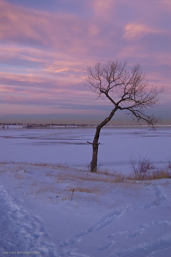
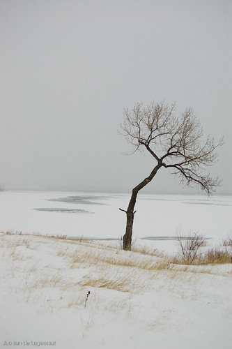
Two days ago, I was with my wife and kid at a lake where we hiked a little and I took some photographs. It was in the middle of a snowstorm and I needed extreme white balance values to get correct color. So yesterday, as I saw that the sky was clear and the sunset would give nice color I went there again to make photos at more or less the same time. The differences are astounding. Where two days ago this very distinctive tree looked like this:
Yesterday it looked like this:
Quite different indeed.
Another example (bigger version in the link):
Whereas yesterday:
This just illustrates how important it is to be somewhere on the right time to catch the light and the feeling of a place. You can see more images from this place in the flickr set here.
Saturday, December 29, 2007
Friday, December 28, 2007
Extreme white balance
I encountered a situation yesterday evening where I was photographing in a snowstorm at dusk. I did not realize this at the time, but the light was so filtered that the camera registered basically purely blue, while our eyes saw everything as just grey even with some orange tinting. This is what the camera thought a scene should look like:
Completely blue indeed. It thought the white balance was basically similar to daylight. If you do "auto white balance" in Lightroom, this is what it looks like:
Lightroom chose 2850K, which is completely wrong. You would think that with all these clouds perhaps shade is correct:
Much better indeed but still way too blue. To get neutral color, I had to dial the white balance to 11:
Basically at the limit of what Lightroom allows, and this is the result.
Very close to what it looked like. It turns out that you can encounter natural conditions where you have to max out Lightroom's slider to get correct color. I even had some photos shot there that maxed out the slider!
For some more photos of this place, see my flickr set on this place.
Friday, December 21, 2007
Softproofing for sRGB?
Lightroom unfortunately does not support softproofing and it would be very useful for certain applications such as seeing how your image will turn out in print. Softproofing works for that case because a printer's gamut is usually much smaller than the monitor profile (usually close to sRGB) in places. In others, it is wider and there soft proofing is not very useful. Here for example is the sRGB gamut of a typical monitor (wireframe) compared to the gamut of typical US offset print (SWOP):
You can see that there is a large amount of color missing in the blue, green and red parts of the spectrum as you would expect because CMYK is a subtractive color model instead of additive such as RGB. On the other hand, the SWOP spectrum has much more definition in cyans and yellows. This is the origin of the widespread use of adobeRGB as a working space for offset as it will encompass most of the cyan lobe. If you softproof an image in photoshop for the CMYK process, you'll see many of the colors shift tremendously and you can correct for this.
On the web, I see many calls for softproofing in Lightroom so that you can predict how an image will look on the web. These calls are misguided however, and arise from these people having badly calibrated monitors and looking at the images in non-color managed apps such as Internet Explorer, or Firefox before 3.0 beta. In reality, soft proofing apps for sRGB is useless, since if you do it right, you will NOT see a difference at all. This owes to the fact that most monitors are approximately sRGB in gamut. Here for example is the gamut of a typical Apple LCD display compared with sRGB(wireframe):
You see that the display's gamut is smaller than sRGB everywhere. Almost every LCD screen (except the new wide gamut LCDs that very few people have - they are not cheap) is like this. Don't believe me? Here is an image with lots of colors outside the sRGB gamut softproofed for sRGB on my MacBook Pro:
Now look at the same non-softproofed:
Exactly the same indeed! Another reason that I think people get this wrong is that they do not set up the softproofing correctly. This is how you have to set it up for correct results:
You should NOT check the preserve RGB numbers button as you will not see the result of conversion to sRGB, but of when you would simply assume the image was in sRGB instead of the source profile (prophotoRGB in this case). My guess is that lots of people do this erroneously and think that their image changes a lot when going to sRGB. Concerning Lightroom, this means that if your image looks good on screen in Lightroom, it WILL look good when exported to sRGB. Of course, you cannot do much about your audience not calibrating their screen and not using color managed browsers, but using sRGB gives you the largest probability the colors will be correct.
P.S. Note that I used the color LCD profile supplied by Apple for the comparison above. If you hardware calibrate a Mac Book Pro display (even the LED ones) you'll see that the actual gamut is even smaller, making it even more impossible that you could see the effect of sRGB soft proofing on such a machine. ONLY when your display's gamut is larger than sRGB will you be able to see the effect of soft-proofing for sRGB.
Wednesday, December 19, 2007
mogrify LR plugin
See updates below: Mogrify in the default macports installation does not convert to the profile, but will only simply assign a new profile, which indeed is useless. To fix this make sure you install Imagemagick using the command
sudo port install imagemagick +lcms
Not long after I detailed a workflow to print at labs that gives far better results than sending sRGB images, Timothy Armes brings out a plugin for Lightroom that allows you to call mogrify, a part of the open source set of utilities ImageMagick. Check it out here. Highly recommended! This tool allows you to scale (choosing the precise scaling algorithm!) sharpen and convert to an arbitrary profile, all in one step, directly from Lightroom! You just need to know the commandline parameters directly although Tim is adding new stuff to the plugin all the time. For example, to mimic my workflow from a few days ago, you set it up to go to a 16-bit tiff in the ppRGB space, convert to a profile, you do not let Lightroom scale, but you set the mogrify plugin to do it. You just need to calculate the dimensions in pixels, which is easy (ppi*length(inches). In this example, I used fit inside and set it to 5400 pixels, which corresponds to 18 inches at 300 ppi.
As extra commandline parameters, I used:
-profile /Users/{yournamehere}/Library/ColorSync/Profiles/Costco-CO-Arvada-Lus.icc -unsharp 1.2x1+1.5+0.05
The first converts to the profile of my local costcos and the second applies an unsharp mask that nicely sharpens the output image. I need to play with the parameters a little to get the best results, but these are pretty good already.
At the end, the whole image gets saved as a jpeg. Very convenient!
Update I: Of course a minute after I post this, the plugin gets updated to support sharpening from the interface. So you only need the profile command.
Update II: To strip the profile from the files (to save upload time to your lab) use the commandline tool mogrify from terminal.app after the export. The command is "mogrify +profile filename". If you have a folder of files, just cd into it and use * for the filenames.
Update III: It appears that mogrify does not actually convert to the new profile! So this might be far less useful than I thought. Stay tuned....
Update IV. It turns out that the ImageMagick in MacPorts by default is compiled without lcms support! So it will not convert between profiles, but just append another profile - useless. To make this work, you need to compile ImageMagick from source and installl it and then use the mogrify binary from that installation. This is fairly simple to do but takes some explanation. Bottomline: this can be made to work, but not without a small amount of effort.
For some reason, installing imagemagick in MacPorts with the lcms variant does not work! So you'll have to compile from source. Bummer!
UPDATE V: OK it turns out there is some weird issue because I have been running macports for ages. It did not actually uninstall and install ImageMagick when I told it to. To fix this, if you run into this problem, simply use the commandline:
sudo port -f install imagemagick +lcms
This will force it to actually install it, even though it finds remnants of old imagemagicks. After this the profile conversion works for me in the Macports install.
UPDATE VI: To strip the resulting image of its profile so that you have to upload less bytes, specify -strip in the commandline after the -profile statement. You can also just strip the profile by specifying +profile icc instead.
UPDATE VII: If you get strange results try specifying the source profile before the destination as in -profile /path/to/source -profile /path/to/destination. On my machine, the prophotoRGB profile can be found in an adobe installed folder and can be called like: -profile '/Library/Application Support/Adobe/Color/Profiles/Recommended/ProPhoto.icm' The quotes are essential because of the space in the folder name.
Sunday, December 16, 2007
A (mildly) Lightroom workflow for printing at costcos and getting superb color
Update: see edit at the end:
Update II (5/20/08): Lightroom 2.0 has made this workflow unnecessary. Check out my post on it.
I decided to detail my printing workflow I follow in Lightroom and Photoshop. This workflow will yield photographs up to 12"x18" (the largest most places print in 1-hour service - not a real limitation) with color and dynamic range rivaling and in some cases exceeding very expensive inkjets, but at a fraction of the cost. I use costcos for this purpose as they are fast, good, provide icc profiles and close to where I live, but I am sure other comparable labs will do fine too with a similar workflow. Labs that use Noritsus or Fuji Frontiers will all have very similar quality. My local costcos uses Fuji Crystal Archive paper, which is somewhat thin for larger prints, but gives excellent color fidelity and deep dynamic range. The machines raster scan a laser at three colors over this paper to expose the paper which is then developed using conventional chemical processes. You're actually getting a real photograph from a digital file. The workflow I'll discuss is done in photoshop, but you could use any program that can convert images between icc profiles. For example preview.app from Apple. This sort of sequence is necessary because Lightroom will not export directly to arbitrary icc profiles. Hopefully that will be built in in a future version?1
Preparation:
1. The first step is to download and install the icc profiles for your lab. Costcos makes them available on their photo upload pages, but they are actually done by dry creek. You can see if you can find your lab there. Download them and install them in a place where photoshop and other color managed apps can find them. On Macs that is simply ~/Library/ColorSync/Profiles or/Library/ColorSync/Profiles. On windows it is somewhere deep in the crypts of the OS. Check this page for instructions. Once installed, you should once every few months check if there is an updated profile.
2. Set up photoshop correctly. Many photoshop installations are setup incorrectly due to bad information floating around on the web. The way You should set it up is to respect embedded profiles and warn for profile mismatches. You get to the dialog in Edit:Color Settings. See below for a suggested setting:
So only the top two options are meaningful. Now you have setup Photoshop correctly and it is time to describe the actual workflow:
Workflow:
1. Select the photos you want to print and crop them to the desired aspect ratios of your final prints. Typical print sizes are 4x6, 5x7, 8x10, 8x12, 12x18, etc, so your usual ratios are 2x3, 5x7 and 4x5.
2. Export your photos from Lightroom using the prophotoRGB profile (why ppRGB? check here) in a 16-bits Tiff or psd. At this point I use two different workflows depending on mood. I either scale in the output dialog of Lightroom, or in Photoshop. You should scale to your desired size at a resolution of 300 ppi approximately as this is the approximate resolution of the photomachines.
It s a good idea to create a preset for this.
3. Open one of the exported files in Photoshop.
4. If you did not yet scale to the final size, do it now using the Image->Image size dialog. Again, use 300 ppi for the resolution and type the size in inches or cm of your final print, making sure you have "resample images" checked. This will calculate the actual needed image dimensions in pixels for you and scale to that size. At this stage I use bicubic sampling for the resizing, but you could use whatever algorithm you prefer or perhaps a plugin such as Genuine Fractals.
5. Sharpen for final output. The machines have a resolution of 300 ppi approximately, but they are soft at that resolution which you should try to counteract to get the best prints. You can use many third party sharpeners for this purpose, but to keep this tutorial simple, I'll show you how to use the unsharp mask in Photoshop. Before I open this dialog, I usually zoom the image to 50%. The filter can be found in Filter->Sharpen. Zooming to 50% is a very old trick that allows you to judge the effect of the sharpening fairly well on screen. The settings below are fairly typical for me. An amount of about 150%, a radius between 0.5 and 1 and a threshold of 5 (to avoid sharpening noise).
This should look only slightly crunchy in the 50% preview in the big window. Experiment with this to see what works best.
6. Now comes the important step.2 In the Edit menu, choose "convert to profile." In the dialog, choose the profile for your printing service:
7. Convert to 8-bit color (Image->Mode->8 Bits/Channel.
8. Save as a reasonably high quality jpeg:
Make sure you do not select the embed color profile option. The machines ignore the profile anyway and the profiles are usually around 1.5 MB, so to save you upload time, do not embed it. Give it a name that describes which profile you used and to which size you scaled it so that you can identify it later.
9. Repeat steps 3 to 8 for all your photos
10. Upload to your lab and print!
You can easily create a Photoshop droplet for all this if you basically always go to the same size. Also check out my older articles detailing how to use the print panel in Lightroom to do basically the same thing, but including logos and such. Here is the original article and here I explain how to add borders and such.
Notes:
1 At this point I should note that you could do this all with just sRGB files. However, in my experience, the color reproduction is not as good as I like. Using custom profiles gets me exact color reproduction.
2 At this point you could first softproof to correct for any out-of-gamut colors. I'll leave that for a later article.
UPDATE: Timothy Armes brought out a plugin for Lightroom that does all this without the need for Photoshop.
Update II (5/20/08): Lightroom 2.0 has made this workflow unnecessary. Check out my post on it.
I decided to detail my printing workflow I follow in Lightroom and Photoshop. This workflow will yield photographs up to 12"x18" (the largest most places print in 1-hour service - not a real limitation) with color and dynamic range rivaling and in some cases exceeding very expensive inkjets, but at a fraction of the cost. I use costcos for this purpose as they are fast, good, provide icc profiles and close to where I live, but I am sure other comparable labs will do fine too with a similar workflow. Labs that use Noritsus or Fuji Frontiers will all have very similar quality. My local costcos uses Fuji Crystal Archive paper, which is somewhat thin for larger prints, but gives excellent color fidelity and deep dynamic range. The machines raster scan a laser at three colors over this paper to expose the paper which is then developed using conventional chemical processes. You're actually getting a real photograph from a digital file. The workflow I'll discuss is done in photoshop, but you could use any program that can convert images between icc profiles. For example preview.app from Apple. This sort of sequence is necessary because Lightroom will not export directly to arbitrary icc profiles. Hopefully that will be built in in a future version?1
Preparation:
1. The first step is to download and install the icc profiles for your lab. Costcos makes them available on their photo upload pages, but they are actually done by dry creek. You can see if you can find your lab there. Download them and install them in a place where photoshop and other color managed apps can find them. On Macs that is simply ~/Library/ColorSync/Profiles or/Library/ColorSync/Profiles. On windows it is somewhere deep in the crypts of the OS. Check this page for instructions. Once installed, you should once every few months check if there is an updated profile.
2. Set up photoshop correctly. Many photoshop installations are setup incorrectly due to bad information floating around on the web. The way You should set it up is to respect embedded profiles and warn for profile mismatches. You get to the dialog in Edit:Color Settings. See below for a suggested setting:
Here I've disclosed the extra options, but they are usually correct. I'm just showing them for reference. The setting for the RGB working space is not that important. Setting it to ppRGB just makes photoshop throw up fewer warnings. When you get a color space mismatch warning when loading a file, always choose "preserve embedded profile." NEVER EVER choose "discard"
So only the top two options are meaningful. Now you have setup Photoshop correctly and it is time to describe the actual workflow:
Workflow:
1. Select the photos you want to print and crop them to the desired aspect ratios of your final prints. Typical print sizes are 4x6, 5x7, 8x10, 8x12, 12x18, etc, so your usual ratios are 2x3, 5x7 and 4x5.
2. Export your photos from Lightroom using the prophotoRGB profile (why ppRGB? check here) in a 16-bits Tiff or psd. At this point I use two different workflows depending on mood. I either scale in the output dialog of Lightroom, or in Photoshop. You should scale to your desired size at a resolution of 300 ppi approximately as this is the approximate resolution of the photomachines.
It s a good idea to create a preset for this.
3. Open one of the exported files in Photoshop.
4. If you did not yet scale to the final size, do it now using the Image->Image size dialog. Again, use 300 ppi for the resolution and type the size in inches or cm of your final print, making sure you have "resample images" checked. This will calculate the actual needed image dimensions in pixels for you and scale to that size. At this stage I use bicubic sampling for the resizing, but you could use whatever algorithm you prefer or perhaps a plugin such as Genuine Fractals.
5. Sharpen for final output. The machines have a resolution of 300 ppi approximately, but they are soft at that resolution which you should try to counteract to get the best prints. You can use many third party sharpeners for this purpose, but to keep this tutorial simple, I'll show you how to use the unsharp mask in Photoshop. Before I open this dialog, I usually zoom the image to 50%. The filter can be found in Filter->Sharpen. Zooming to 50% is a very old trick that allows you to judge the effect of the sharpening fairly well on screen. The settings below are fairly typical for me. An amount of about 150%, a radius between 0.5 and 1 and a threshold of 5 (to avoid sharpening noise).
This should look only slightly crunchy in the 50% preview in the big window. Experiment with this to see what works best.
6. Now comes the important step.2 In the Edit menu, choose "convert to profile." In the dialog, choose the profile for your printing service:
7. Convert to 8-bit color (Image->Mode->8 Bits/Channel.
8. Save as a reasonably high quality jpeg:
Make sure you do not select the embed color profile option. The machines ignore the profile anyway and the profiles are usually around 1.5 MB, so to save you upload time, do not embed it. Give it a name that describes which profile you used and to which size you scaled it so that you can identify it later.
9. Repeat steps 3 to 8 for all your photos
10. Upload to your lab and print!
You can easily create a Photoshop droplet for all this if you basically always go to the same size. Also check out my older articles detailing how to use the print panel in Lightroom to do basically the same thing, but including logos and such. Here is the original article and here I explain how to add borders and such.
Notes:
1 At this point I should note that you could do this all with just sRGB files. However, in my experience, the color reproduction is not as good as I like. Using custom profiles gets me exact color reproduction.
2 At this point you could first softproof to correct for any out-of-gamut colors. I'll leave that for a later article.
UPDATE: Timothy Armes brought out a plugin for Lightroom that does all this without the need for Photoshop.
Wednesday, December 12, 2007
photos, copyright and more
The "web" is abuzz today because of a rather lame youtube video that used some photos from photographers active on flickr without their permission. The photo was taken down apparently because photographer Lane Hartwell did not like the photo being used without permission. Read her reasoning here. For some weird reason wired calls the video (which they link to in the article) creative. I don't see it. It's just lame insiderish jokes set to photos they never asked to be able to use. Wired links to an outrageous post by someone called Robert Scoble which I am not going to link to. Fake Steve Jobs often makes fun of this self-acclaimed internet expert - deservedly so. What a bunch of uninformed nonsense. Using someone's work without asking and attribution in a situation that is very clearly not fair use (the video is clearly meant to promote the maker's website) is rather unethical. How hard is it to ask if the rights of the original do not specifically allow this sort of use? Scoble apparently does not mind. Maybe that says something? Myself I am OK with non-commercial use, as long as people ask me. Parody is fine too since it is protected by copright law, but this video was NOT a parody of the photographer's work.
Monday, December 3, 2007
Zion national Park
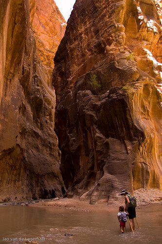
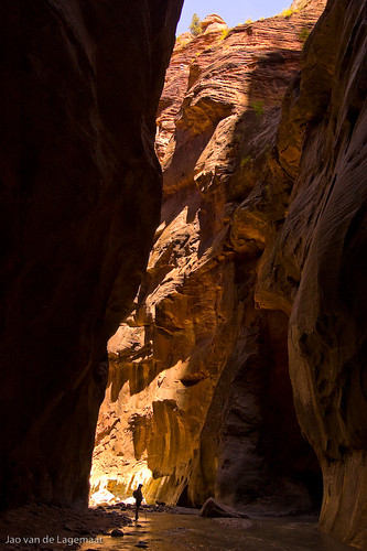
Last August we were in beautful Zion National Park in Utah where among other things, we hiked the Narrows. This is an awesome slot canyon at the end of Zion Canyon.
This is my wife and daughter at the fork in the river. My daughter just loved hiking along the river and especially the many rapids that she would sometimes go up to her neck into.
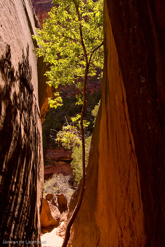
This is a tree that somehow seems to be able to hold on.
My wife ahead of us.
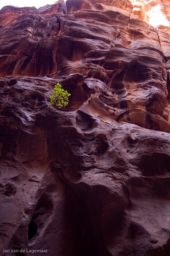
We also hiked at other places and even met a friend that my daughter had made a few days before in Bryce Canyon and her parents, so we hiked with all. Here is a tree perched between rocks:
I like this because of the backlighting on the leaves.
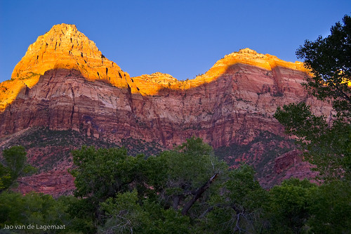
And lastly a sunset from the campground:
More images on the flickr set.
Tuesday, November 27, 2007
RAW files for the D3 and D300
Just found these examples of RAW files taken with the new D300 and D3 and compared to the D200. Lightroom and ACR will read all these files, so you can easily compare them yourself. The white balance is wrong in the file, so use the eyedropper on the grey patches in the colorchecker to get good color. Shortly, the high ISO performance of the D3 is absolutely crazy. It is also amazingly sharp. At 1600 ISO, compare it to the D200 file. The D3 has gobs and gobs more detail. Even if you take the ISO all the way up with the D3 and compare that file to the 1600 ISO D300 or D200, you'll see far more detail. This might be the often discussed full-frame advantage. Quite extraordinary. Makes me lust for a D3, however new windows for the house are more important right now ;-)
Saturday, November 24, 2007
LR export plugins for flickr, smugmug and zenfolio
Jeffrey Friedl who previously wrote some excellent writeups on color management, just released some direct export plugins for Lightroom 1.3 using the newly released SDK for that program that upload directly to your flickr or smugmug accounts. I've tried the flickr one and it works perfectly.
Friday, November 2, 2007
Relevant example for ppRGB vs adobeRGB
I realized after the last post that I need to give a real world example. The example that I am going to give is from the recent shot below:
.
I took this into Photoshop in 16-bit ppRGB and softproofed it to the profile of my local costco's Noritsu and to adobeRGB. In both cases, I show the gamut warning (in grey).
Here is the soft proof for adobeRGB (click for large version):
As you can see a lot is out of gamut in the mountain area that is lit by the rising sun. Especially the green of the trees is far out.
Now take a look at the same for the local costcos:
Far less is out of gamut. Especially the green/yellow of the lit trees is not at all out of gamut, while it was in adobeRGB. This clearly shows that in real world images, you lose colors that even not so wide gamut machines can print if you use adobeRGB as a working space. Of course, there are not really any displays that can actually display these colors...
Why use prophotoRGB instead of adobeRGB as a working color space?
Lightroom uses a variant of prophotoRGB as its internal colorspace and when you export to photoshop, it defaults to prophotoRGB. One could argue that this is overkill and adobeRGB should be wide enough. However, typical DSLRs can easily capture color outside of adobeRGB. "What does that matter if you cannot print those colors?", you might ask. The answer is that as soon as your printer has more inks than just CMYK, you can reproduce colors outside of adobeRGB! This can be easily shown when comparing profiles in Apple's excellent and free colorsync utility app. Even worse, you do not need a good printer to reproduce these colors, if you send your images to Costco's, Adorama, smugmug, and such for printing, you could be using their profiles for conversion and you would be able to reproduce color outside of adobeRGB. Don't believe me, here is the proof:
The wireframe in this graph is adobeRGB, the solid, colored volume is the glossy profile from my local costcos. As you can see the costco profile indicates that their Noritsu in this case can generate color outside of adobeRGB! Now compare this with the same figure for prophotoRGB:
As you see the entire range of colors that costcos printers can reproduce is enclosed.
Of course if you are working in less than 16 bits (everything in LR is 16 bit, so that is not anything to worry about), ppRGB might not be a good choice as you blow up the difference between 2 color values too much and you might get posterization. Fortunately, basically everything in Photoshop is 16 bits nowadays. So for prints from costco, a good workflow is to export to 16-bit ppRGB tiffs/psds, convert to the right profile in photoshop and then convert to 8-bit and save as a jpeg.
Thursday, October 25, 2007
Effect of aperture on depth of field
I recently did a silly little test that every photography book tells you to do as practice, but for some reason I had never done. The test is to show the effect of aperture on depth-of-field. The more open the lens (smaller f-stop), the shallower the depth of field is and conversely, the smaller the lens opening, the larger the depth-of-field. Also focal length plays into the equation. Here is a simple calculator that shows you the depth-of-field for a certain f-stop/focal length combination. Strange that I never actually did it as I use the effect all the time in my photography to for example isolate people from their backgrounds. It is the number one thing that makes people think you are a professional, so it is a good idea to know how to use it. Here is an example of a prime Nikkor 50 mm/1.8 lens on a DX Nikon DSLR:
f/1.8
As you see, the depth-of-field is extremely narrow and does not even extend throughout one leaf.
f/2.8
At 2.8 the depth-of-field is much less narrow and several leafs are in focus.
f/5.6
At 5.6 most of the field is in focus, but the extremes are still blurry.
And finally, f/11
Basically everything is in focus. If you go much further on a small sensor (DX) DSLR, you will loose resolution due to diffraction. In the last image, at f/22 this is the case, but fortunately, you will never see this at websizes, you will even have trouble seeing it in largish prints.
f/22:
Again, simple, but I thought an effective demonstration.
Lastly, a demonstration of the effect in a simple portrait:
Bride getting ready:
As you can see only her right eye is in focus. Her left eye is already out.
Saturday, October 13, 2007
Smugmug
I started setting up a site to sell photographs from weddingshoots. After lots and lots of research, I started using smugmug.com. They have incredibly nice galleries and a very easy to use ordering system for your clients. So far, I love them. If you sign up, use code O4fziJ8xijDDw in the referral field. Saves me and you money. Check out my page too!
Monday, October 1, 2007
Arvada art studio tour
I live in a small suburb town between Denver and Boulder called Arvada. Every year a studio tour by local artists is organized. As you might expect the level wildly varies. We visited some interesting photographers here too. The first ones that struck my fancy were Charlie and Susie Brown. They make some extraordinary pictures. A lot of them are vertically or horizontally digitally stitched panoramas that show a really good eye. I loved the vertical panormas. Very impressive work. Their presentation was absolutely lovely. I loved that lots of the work was done on the 6 MP Canon 10D, more proof that your camera doesn't matter. Check out their website for sure. I also saw some work by Ron Rathbun that was interesting. Ron is a more traditional photographer that shoots exclusively Velvia slide film. His wife makes western style watercolors. Wonderful people and wonderful artworks. Check out their website. I will be sure to participate in this fun event too next year.
Friday, September 21, 2007
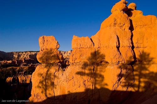
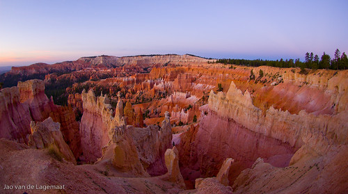
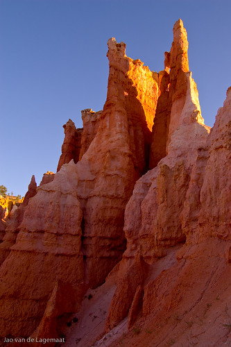
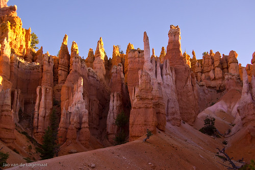
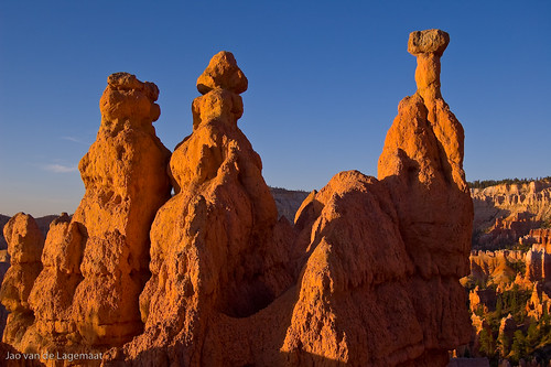
Weird formations in Bryce
Wednesday, September 19, 2007
More precise values
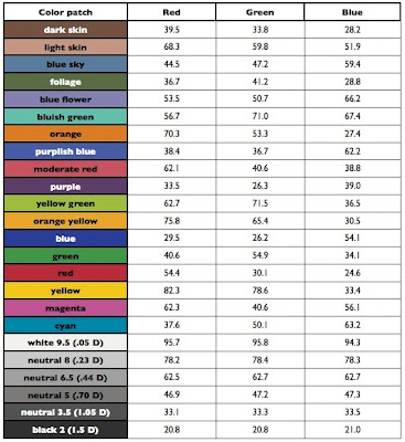
I found a much more precise table of values on this site. I used the Babel 2005 16-bit average values in ppRGB space and transformed the numbers into Lightroom percentages taking into account the 2.2 gamma of lightroom. The table below has the actual values. Again, I had to make it into a graphic because of blogger's braindead handling of inline tables. You can see that there are small differences in most places, but one patch is quite different. Funny enough (because it is the color people complain about in ACR/LR), it is the orange patch that was 2 percent off in the blue channel. Use these values if you're using a colorchecker inside lightroom.
Tuesday, September 18, 2007
Lightroom values for the colorchecker chart
Since Lightroom's colorspace is based on prophotoRGB but has a different gamma, you cannot use any of the published values for the color patches in one of the Gretag MacBeth colorcheckers that many people use to check the color rendition of their toolchain and that you can use to calibrate the color rendering of ACR for your specific camera. Usually you would do this in ACR/PS, but if you only have LR, what do you do? Well you can use the below values in Lightroom and do it manually by going back and forth between patches and changing the hue and saturation in the camera calibration part of the develop module (after white balancing on the second grey patch!). These values are based of the values in this excellent page, so there will be a small error in there of about 1%. I simply did the appropriate transform to gamma 2.2 for the values in the ppRGB column. The values are in percent of the channel in R,G,B laid out just like the colorchecker chart.
Honestly, I have no idea why not all the grey patches are neutral, but this should help those manually calibrating in Lightroom.
EDIT: No idea why, but blogger messes up my HTML table, so it is now just a picture of a table. Hope this still works.
UPDATE 9/19/07: I uploaded a table with more precise values from 16-bit values of the colorchecker reference in the next post.
Friday, September 14, 2007
Lightroom 1.2 and ACR 4.2
Adobe just released the Lightroom 1.2 and ACR 4.2 updates (use the adobe updater app in CS3). It includes support for the yummy Canon 40D and, for me at least, it solves the weird watercolor paint effect that some pictures took on in Lightroom 1.1. This is a must have update if you use either.
Saturday, September 8, 2007
Getting up in time for good light
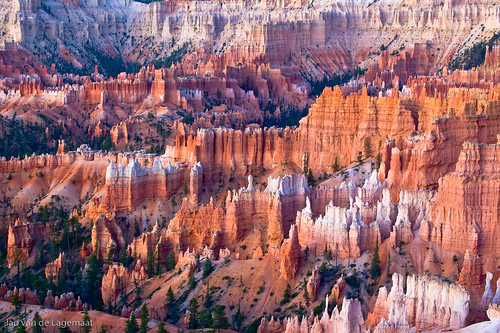
It's often said that 50% of landscape photography is being able to get up in time to catch the light around sunset. I saw a dramatic example of this recently in Bryce Canyon where I was camping with my family and got up at 5 am to shoot a few images. The rest stayed in their sleeping bags for good reason. It is cold early in the morning in Bryce even in summer. I shot 100's of images and put only a very small subset on flickr. Here is an example from right before sunrise (bigger in the flickr link):
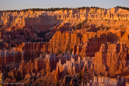
You see an amazing amount of color in the rocks including purples and magentas. Here is almost the same view shot just a few minutes later when the sun hit it:
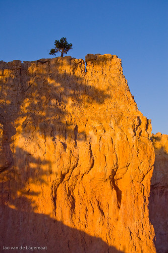
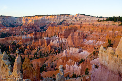
Still pretty, but all the purples and magentas are missing and completely overwhelmed by the color of the sunlight! Here is an example where you can see it inside of one single image:
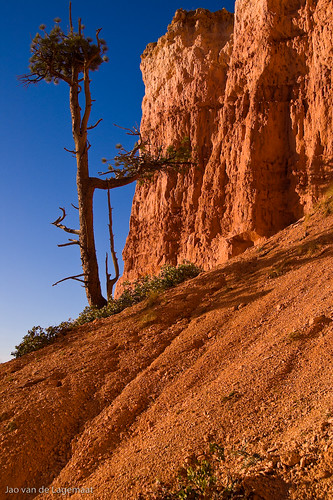
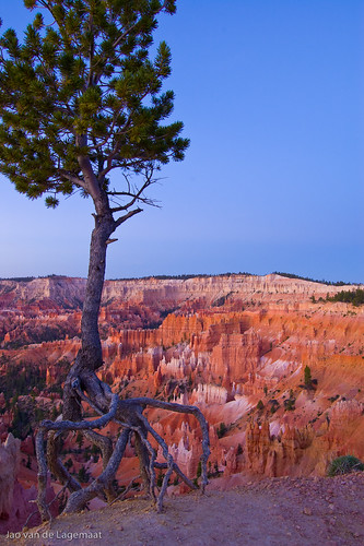
I just love the next image of the tree where all the roots are exposed because of the soil eroding away, a dramatic illustration of how this place is formed:
There were a few people that got up in time to watch the sunsets, a lot of them flashing their cameras into the sun (don't you love automatic mode on P&S's). There was also a funny photographer couple that was just complaining about the tourists and other people photographing (what do you expect in Bryce canyon?) and appeared to miss all the good shots because of it. I might be wrong though as of course, I did not see their photos. To me it just illustrates that you need to focus on your own photography and have fun doing it.
Subscribe to:
Posts (Atom)